Background
Currently, Crossref is not communicating metadata statistics to its members. Can we show members the value Crossref brings by creating awareness through data? To help bridge the gap in communication an online dashboard will be developed to visually showcase the value of Crossref metadata.
Problem
Creating awareness - Crossref metadata can appear complicated and unapproachable by some members. So the dashboard should simplify complex metadata points. The data should be presented in a visual format, so patterns and trends are easily highlighted to make the data easier to understand.
Increase data engagement - The current statistics webpage is underutilised, and there is no meaningful method to keep members aware of the trends of metadata usage. The dashboard will help visualise information and increase engagement and interest in data by making it more visually appealing and interactive. To help exploration and discovery, as well as promote learning and understanding.
Data visualisation can help to improve the communication of data and information, It can also help to tell a story and convey a message more effectively than text or tables alone.
Data visualisation research
I spent a large amount of time researching a variety of data visualisation libraries, each library had its own tools and resources to help design and create data visualisations. These libraries provide a wide range of pre-built visualisation tools, which makes it easier to rapidly create data visualisations. I researched the following libraries:
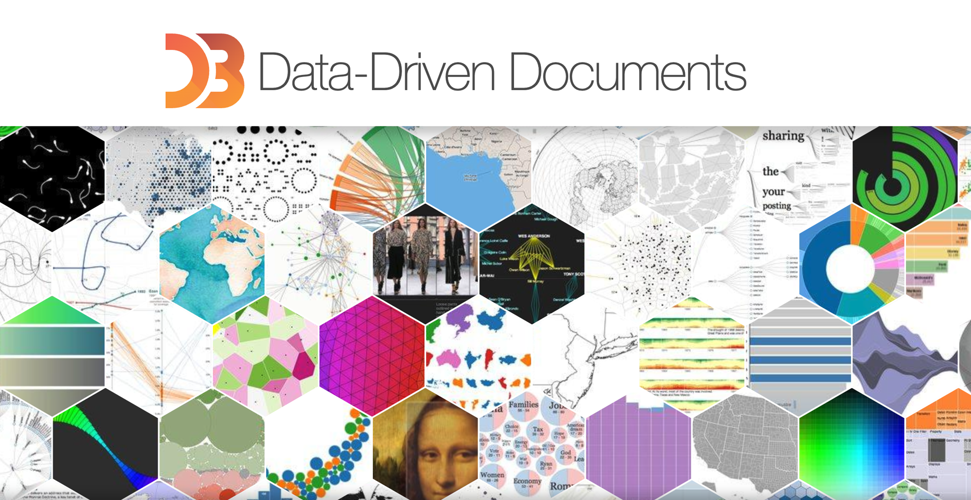
D3.JS
D3 (Data-Driven Documents) is a JavaScript library which uses web standards to visualise data, using SVG, Canvas, and HTML. D3 allows you the capability of displaying complex data visualisations through browsers, using JavaScript. D3.JS webpage
Metrics Graphics
This library called MetricsGraphics, which is built on top of D3, is designed specifically for displaying and visualising time-series data. The tool can quickly and easily create data visuals.Metrics Graphics webpage
C3.JS
C3.JS packages the code to create data charts, C3 makes it simple to develop D3-based charts. And you are not required to write D3 code. Each element that C3 generates is given a class, allowing you to create a unique style.C3.JS webpage
Metrics Graphics
This library called MetricsGraphics, which is built on top of D3, is designed specifically for displaying and visualising time-series data. The tool can quickly and easily create data visuals.Metrics Graphics webpage
Research findings
After considering a number of data visualisation libraries, the D3.JS data visualisation library best suits the project's needs and is compatible with Crossref API technology. D3.JS is open source and has a great developer community, so we could best understand how to use the libraries. online developer support from the community that uses it.
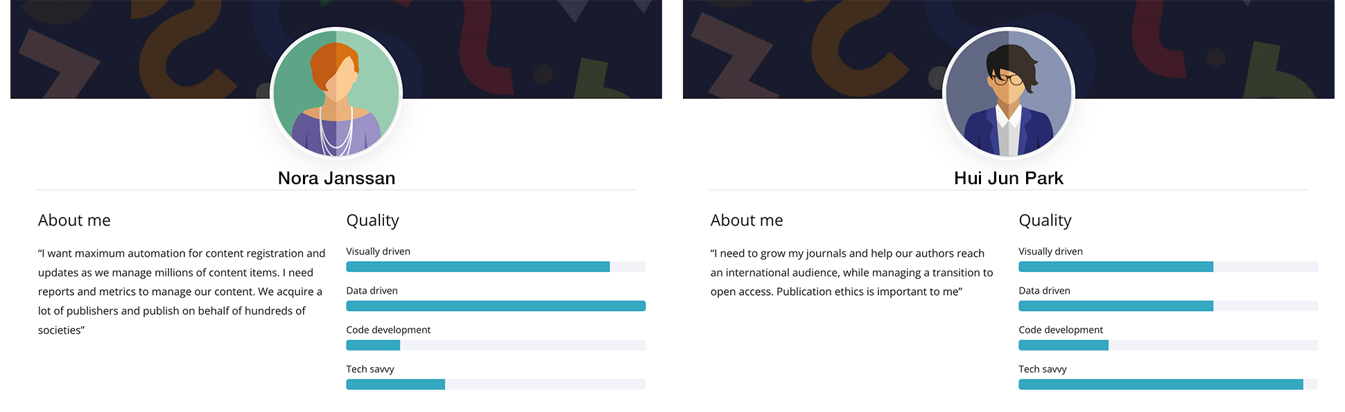
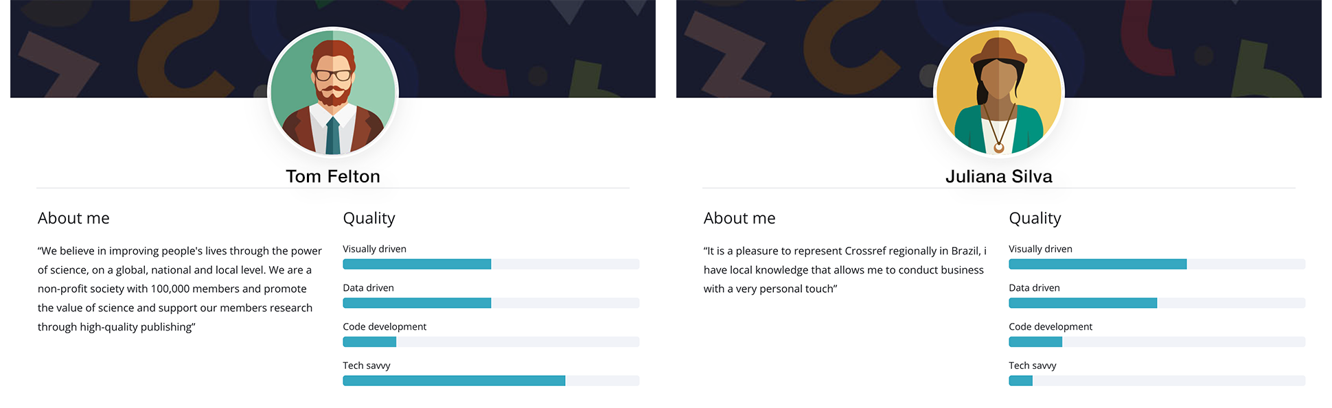
User personas
Understanding the audience will help develop the dashboard for the Crossref member base. Personas where selected to help highlight areas of the design which needed to consider a wide array for user needs. User persona library: Crossref user personas
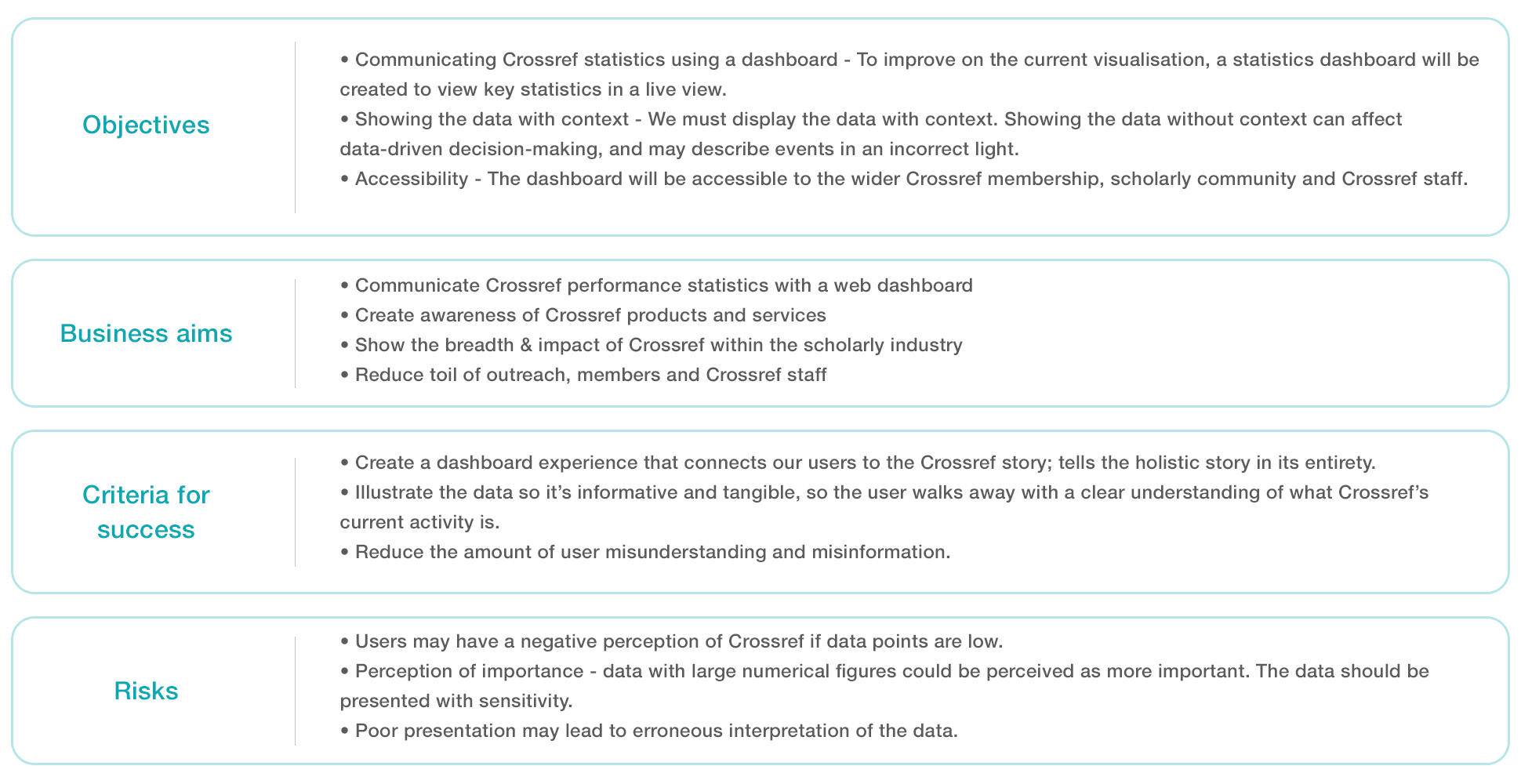
Objectives
The key objective is to effectively communicate Crossref statistics using a dashboard and also make sure the data is being displayed with context to help tell a story.
Use cases
Developing use cases is an important step in product development. Use cases help to identify user requirements in a way that is clear and understandable to all stakeholders. This helps ensure that the product meets the needs of its intended users. A list of use cases is created to help start the development of the product.
Data library feature list
Specific features and functionality that are intended for the dashboard are listed in the feature list. The list of features will grow as the development process picks up speed.
Data card - 1 Membership geographic representation - Library: www.observablehq.com
Data card - 2 Current registered content records - Library: www.dataaddict.fr
Data card - 3 Membership geographic representation - Library: Gitlab library
Data card - 4 Membership geographic representation - Library: Gitlab library
Design vision
Establishing a design vision aids in giving the visualisation dashboard a clear direction and purpose. A design vision provides direction by outlining the key design principles, and desired user experience. This helps to focus the design process and ensures that design decisions are made with a clear purpose in mind.
Ideation
The design concept phase of the project first began with creating low-fidelity sketches for rapid design iteration. And I then proceeded to build design mockups which needed to consider key design aspects:
• Create a dashboard experience that connects our users to the Crossref story; tells the holistic story in aggregate
• Illustrate the data so it’s informative and tangible, so the user walks away with a clear understanding of what Crossref’s current activity is.
• Reduce the amount of user misunderstanding and misinformation.
Taking on the task to lead the design and development planning of the web statistics dashboard. I demonstrated project direction skills to lead the team in biweekly catch-up meetings. The dashboard prototype was taking good shape with an aim to build a production prototype to test the API technology. As project leader, I was responsible for researching the feasibility of the technology and holding meetings with individuals from the development team and also external developers. I enjoyed taking the basic idea of a dashboard and collaborating with different teams to push the project forward.
Test interviews were conducted and feedback points were analysed to and further design iterations were made. This helped to solidify the designs and helped developers understand how charts should work using what data.
Creating a usability test plan
Test plans help to identify areas of the dashboard which need to be reviewed. The test plan will include a list of 11 Crossref staff members, the plan also outlined the testing session breakdown of tasks.
Questions & tasks
Staff were all given a task to perform using the clickable prototype and the user will also be asked questions on how they are perceiving the workflow. A defined list of questions tailored toward the user will be used to extract feedback points.
Feedback analysis
A set list of questions specifically designed for each staff member will be utilised to collect feedback points. Each staff member is given a task and asked to use the clickable prototype, and asked questioned about how they are perceiving the data being displayed.
The final design output was concise and bold in design, the information was clearly laid out and communicate the data effectively. The following design elements were incorporated into the final dashboard:
Design language
• Telling our story with data, and creating a narrative.
• Creating a linear reading experience with a top-to-bottom scrolling experience.
• Breaking the experience into three defined areas: Members, Metadata and Usage.
Interaction
• Scrolling the page down is the main interaction.
• Mousing over - Mousing over the “i” (information) icon on the data card will trigger a tooltip. This tooltip will provide more information and context about a given chart.
• The charts and the whole web experience will have second-level pages or modals. This will help to create a simplified experience.
Animation
• Animation makes the charts more engaging to look at and shows the data has just been loaded and gives the sense the data is the latest information.
• Appearing and disappearing off-screen using transparency fade.
• Animation style - Adding bounce and weight, acceleration with easing.
Content
• Data cards - are different from one another, so you are not experiencing the same visuals
• Add a visual hierarchy to the content so the most important data is communicated first.
• Download data - for more in-depth analysis.
• Not drilling down into data sets, keeping the experience precise and focused.
• Describing each chart, and its meaning (Bar chart, radius, doughnut) axis of data.
Visual hierarchy
• The content is the primary visual element in the design.
• Titles and information icons have been treated as a secondary visual components.
• Showcase banners - help to give an insight into a very small data set - add small context to the data.
Colour
• Dark background allows the content to really stand out and adds higher contrast between the charts/content and the background.
Testing the designs highlighted points which needed further design thinking and investigation. One area which needed further exploration was to help users track their progress. Visual design style guide: Material design style guide
Final dashboard design
Visualising data immensely improves communication and helps to humanise data points and makes information accessible and understandable to a wider audience.